Digital Art Lesson 4 of 4: Differences in Color (How-To GUIDE)
Welcome back to Digital Art 101, an ongoing series seeking to answer the most common distributor and end-client questions, and today we are discussing colors and how it affects your final product. Below are the previous lessons we have tackled.
Color in reference to print and design exists in several different forms, but the most common gamuts or color ranges are RGB, CMYK, and PMS (SPOT) color.
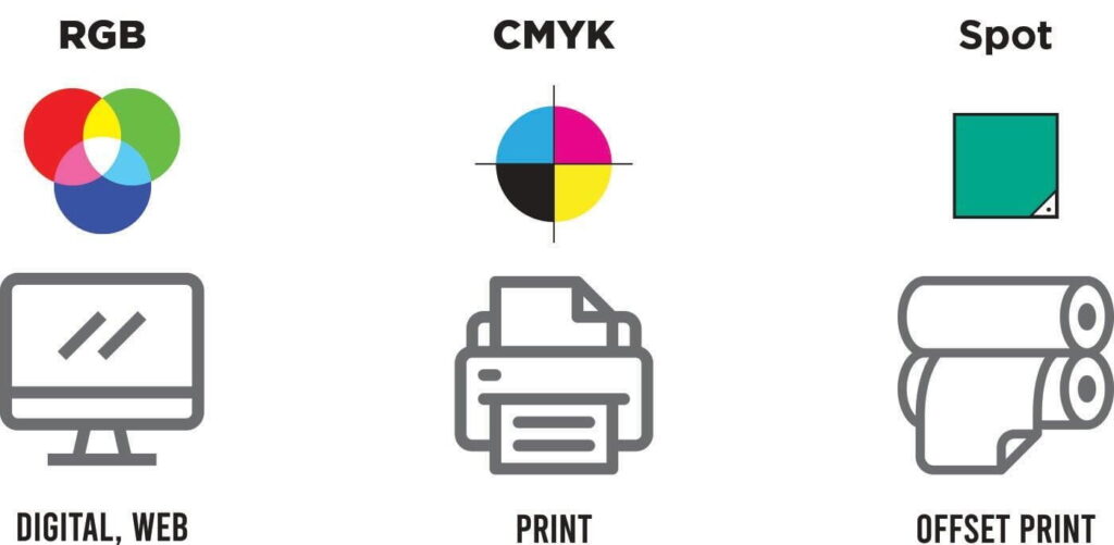
RGB Color Range
RGB color is the color of lighted screens and the most diverse of the design color gamuts, able to display nearly 16 million colors due to its combination of colored lights of RED, BLUE, and Green. Despite their range, no two screens are the same and are highly variable. Keep this in mind when discussing colors in a proof, because what may look right to you, can look quite different on a higher or lower-quality screen,
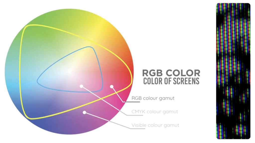
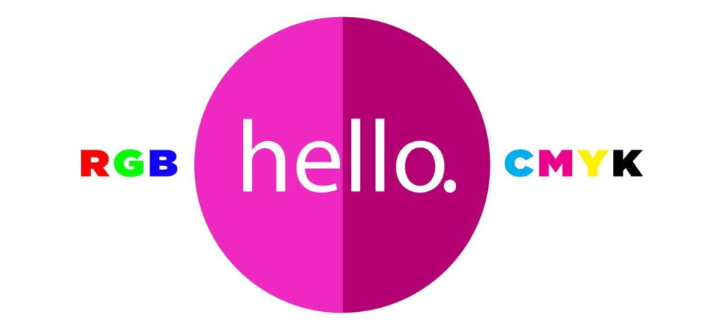
Since customers can see colors as bright and vibrant on their screens, they often have questions as to why their proofs may look dull or off in comparison. RGB is able to display colors that are simply not always achievable for a CMYK process. Because of this, we make proofs in the CMYK color profile to show these limits.
CMYK Color Range
CMYK refers to the color process in which the four colors cyan, Magenta, Yellow, and Black are combined together to make full-color imprints. Because there is no light behind these colors when printed on a surface, the color range for CMYK seems quite dull and limited when compared to RGB, especially for neon colors, dark blues, or dark blacks.
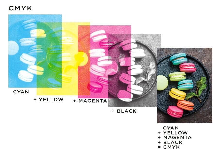
Throughout these lessons, you have heard me use the terms CMYK, Four Color Imprint, Offset Printed, and Digital Print rather interchangeably. But they all mean the same thing when it comes to the final product. This process is used for products like our lip balms, offset-printed lapel pins, stickers, buttons, and dye-sublimated lanyards.
PMS (Pantone Matching System)
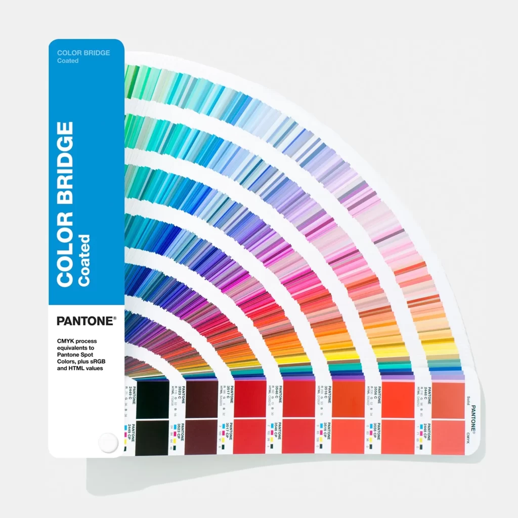
When discussing colors, get used to using your PMS book. Screens can be variable, but a PMS color book is the same no matter where you are in the world. A PMS book is the easiest way to communicate colors with a client, especially for products like embroidered patches. At IDProductsource, we primarily use the Solid Coated PMS Book, but it is possible to request neon or metallic colors for certain products or imprints.
In the photo on the left, you can see an example of a Color Bridge PMS book, which is handy to show a PMS color and its CMYK equivalent color on the right column.
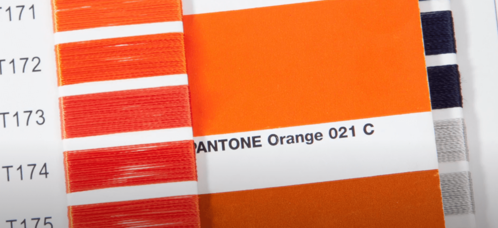
PMS stands for Pantone Matching System and is a standard color system in print shops and factories. We use PMS color for any products that use color-fill’s, woven patches, silicone, PVC, and have silk-screened imprints.
Customers will sometimes ask you to PMS color match for CMYK or embroidered products,
and while we take great care to find the closest color equivalents we can’t always guarantee a match.
So that’s it! You have completed our Art Lessons Series.
Have more questions about art for us?
Leave us a comment!
Related Articles
Digital Art Lesson 3 of 4: Is my art good quality? (How-To GUIDE)
Welcome back to Digital Art 101! An ongoing series seeking to answer the most common distributor and end-client questions. Last time, we discussed the difference between Vector and Raster and how to identify them. Today, we will go over how to check ...Digital Art Lesson 2 of 4: Checking Art (How-To GUIDE)
Welcome back to Digital Art 101! An ongoing series seeking to answer the most common distributor and end-client questions. Last time, we discussed the difference between Vector and Raster. Today, we will go over how to check the art and identify the ...Digital Art Lesson 1 of 4: Vector vs Raster (How-To GUIDE)
Vector vs. Raster Want to sound like an art pro? Distributors and suppliers in the promotional product industry know just how much good quality art is pivotal to a beautiful end product. So with that in mind, read on and stay tuned for our Digital ...Easy Order Guide
Submit your Artwork With a wide variety of products with their own unique Imprinting Techniques IDProductsource wants to make the process of preparing artwork as easy as possible for you. Accepted: Art File Types Usable Art Send us your artwork and ...Can we PMS Color Match Offset printed items? (Q&A)
Question: Can we PMS Color Match Offset printed items? Answer: No. CMYK colors use a different color system then PMS colors. We can try to PMS color match your order, but we make no guarantees of its accuracy due to limitations of screen ...
Popular Articles
Less Than Minimum Formula
Frequently Asked Questions Q We will walk you through the Less Than Minimum Formula (LTM), and how it works. A On the Product Display Page (PDP), if the product states LTM formula applies you can order less than the 1st published increment and price ...Tariff Escalation Timeline
U.S. Tariff Escalation Timeline • February 1, 2025: The Trump administration imposed an initial 10% tariff on Chinese imports. • March 3, 2025: An additional 10% tariff was added, bringing the cumulative tariff rate to 20%. • April 2, 2025: A ...Our Lead Time & Carrier Transit Time (estimated) (How-To GUIDE)
OUR LEAD & CARRIER TIMES Our lead times and product origination are clearly published on our website for each product we offer. (These are subject to change without notice) IDProductsource makes every effort to guarantee ship dates on RUSH PRODUCTS ...Can you Mix and Match Material or Imprint Colors on Lanyards? (Q&A)
Q Can you Mix and Match Material or Imprint Colors on Lanyards? A Yes, you can mix and match both material & imprint colors on a lanyard as long as the imprint itself is staying the same across all of the lanyards. General rule of thumb would be that ...Do you allow Drop-Shipping to different locations? (Q&A)
Question: Do you allow Drop-Shipping to different locations? Answer: Yes, we do allow drop-shipping to different locations with a majority of our products. Split/Drop Shipment: First location is Free + Normal Shipping Costs; Each additional location ...
Recent Articles
Self Promo Suites: Patches
Our Self-Promo Suite is built for distributors. Download, save, and customize with your own logo to promote yourself and your brand. It’s just one more way IDProductsource proves we’re partners—not competitors. Flyer: Social Post: Story:Self Promo Suites: Buttons
Our Self-Promo Suite is built for distributors. Download, save, and customize with your own logo to promote yourself and your brand. It’s just one more way IDProductsource proves we’re partners—not competitors. Flyer: Social Post: Story:Self Promo Suites: Lanyards
Our Self-Promo Suite is built for distributors. Download, save, and customize with your own logo to promote yourself and your brand. It’s just one more way IDProductsource proves we’re partners—not competitors. Flyer: Social Post: Story:Self Promo Suites: Cutting Boards
Our Self-Promo Suite is built for distributors. Download, save, and customize with your own logo to promote yourself and your brand. It’s just one more way IDProductsource proves we’re partners—not competitors. Corporate gifts season is Quarter 4! ...Self Promo Suites: Ornaments
Our Self-Promo Suite is built for distributors. Download, save, and customize with your own logo to promote yourself and your brand. It’s just one more way IDProductsource proves we’re partners—not competitors. Corporate gifts season is Quarter 4! ...